This strategic branding initiative was introduced
to solve irreconcilable perception issues
JTL are the UK’s leading training provider to the building engineering services industry.
It is a government funded organisation charged with improving the UK skills base.
It is a two part task. First to recruit potential young people to train as electrician and plumbing apprentices.
And then to place them within firms in their area that will provide the on-the-job experience
that is intrinsic to a modern apprenticeship.
It was proposed that Brandgarden devise a name and create a new marketing brand
to package JTL’s range of employer services. And then to plan and execute
a direct marketing campaign to identify prospects for JTL’s sales force.
![]()
JTL’s existing brand and marketing was ineffective
because it took a one-size-fits-all approach
The company’s existing brand identity was created from a single perspective but was expected
to appeal to two very different audiences.
One audience are parents with children of school leaving age.
[see jtl apprentice brandstudy]
The other audience are electrical and plumbing businesses – from small private outfits
all the way up to large multi-million turnover businesses.
The solution was to separate the messages and give the business proposition
its own brand identity and tone of voice.
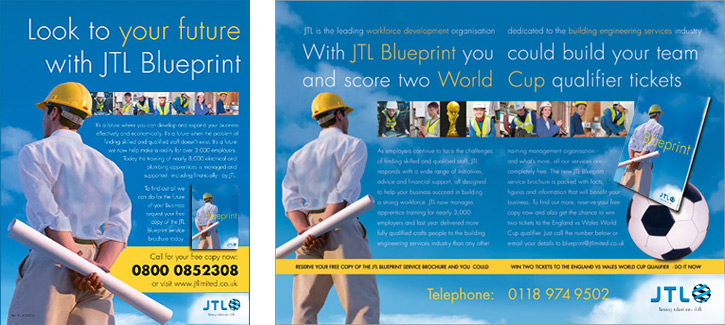
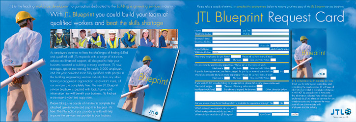
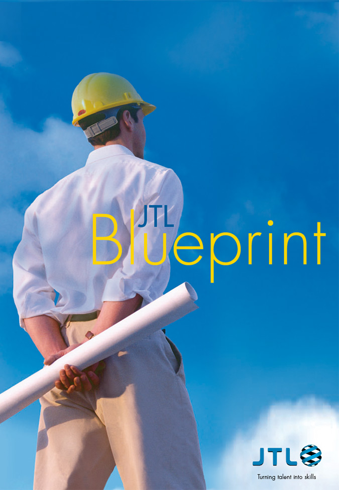
The JTL Blueprint branding scheme was conceived to provide business owners with a full package
of information and support services to recruit the apprentices they needed.
A Blueprint branded direct marketing campaign
used all available media channels
A fully integrated direct marketing campaign was conceived to incorporate a number of tests
to evaluate different offers, incentives and media channels. Advertisements and inserts
in the trade press were designed to perform the “double -duty”
of creating brand awareness and generating response.
Synergy delivered the highest levels of economy and efficiency which meant funds could be
reallocated from production to purchase additional space, lists and print.
The direct mail campaign went to 65,000 businesses and achieved record response levels.
It utilised a number of prize draw incentives and also provided a great deal of essential profiling
and demographic data, gathered using a questionnaire combined with the draw entry card.
The Blueprint campaign produced more requests, for more apprentices,
than any previous promotion initiative deployed by JTL in its 20-year history.
Advertising in trade journals
A nationwide direct marketing campaign
Mailing to existing client companies
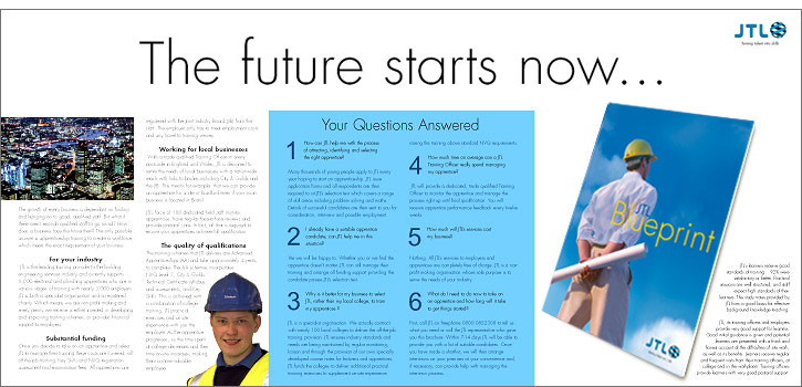
A complete redesign of
JTL’s 32-page Service Brochure
All existing client employers and existing prospects were sent a full recruitment/fulfilment pack.
This contained the completely redesigned Blueprint branded service brochure.
The Blueprint branded recruitment
campaign exceeds 4% response
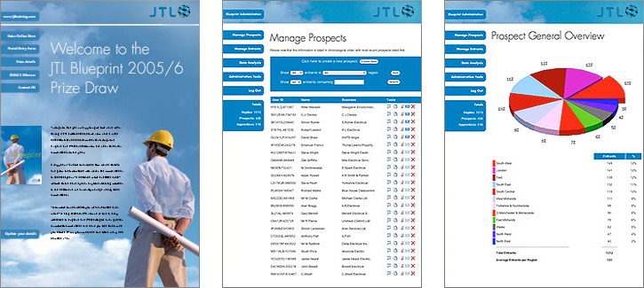
A dedicated website to collect and analyse response
and to distribute leads to the national sales force
People wishing to respond to mailings, inserts or press advertisement had the option
of replying by post or registering their interest on the purpose built website. Postal responses went directly
to JTL’s offices and the data was input to the Blueprint website by JTL support staff.
The website tracking system gave live reports of response statistics and categorised them by type business
type, size, geographical area and a full range of analytics.
Regional sales teams could use the website to respond enquiries, make appointments
and a whole range of apprentice placement functions.
Performance of the entire system could be monitored centrally by JTL senior management
and also by regional managers to help with the task of optimising the activities of their sales teams.
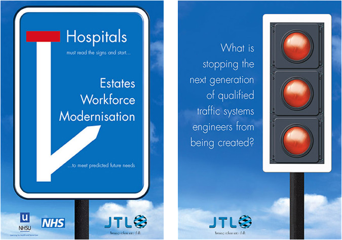
The Blueprint brand identity was also deployed tactically
to unify the presentation of specialist courses
JTL also marketed a range of specialist courses and sector specific qualification programmes.
These were promoted in response to market developments and government advised initiatives,
changes in legislation and technical standards.
Literature for these tactical initiatives had historically been produced on an ad-hoc basis.
The Blueprint branding scheme unified them into a coordinated set of brochures
that fitted with the main service brochure as a supplemental prospectus.
This transformed what had previously been a distraction into increased
credibility for the brand and more revenues for the business.
A new corporate identity
This logo was deployed to communicate an entirely new range of brand values.
JTL wished to be seen as professional, efficient, technically aware and generally in-tune
with the needs and tastes of their employer clients.
JTL national conference staging
Putting together the branding and presentation of a conference
for a non-profit making organisation means striking the right balance between prestige and cost.
JTL’s National Conference is a key event designed to bring together employers,
training providers and colleges in support of the Government’s Skills Strategy.
Jigsaw puzzle pieces is probably the most cliched and over used
business metaphor. Reason enough to discard it?

But here the interlocking heads (blue for businesses and yellow for young people)
perfectly symbolises the relationship between employers and apprentices,
which is central to the JTL mission and purpose of the event.
By giving this meaning to a tried-and-tested visual metaphor,
we produced a conference brand identity of stunning simplicity
which had impact, context and function.
With a little careful planning it was possible to create just one master illustration
which could be applied to all the staging materials
and event signage as well as all the printed documents; mailings,
the day agenda, stationery and conference pack,
keeping costs to an absolute minimum.
The two-colours iconography is a perfect distillation of what had emerged
from the brand development process as two JTL sister brands:
one targeting young people and their parents
and the other targeting building industry professionals.
The trick to piecing together a dual brand strategy
to address two different target audiences
When work on JTL commenced all the company’s marketing collateral
was dominated by a very dark blue. The simple solution of
using a brighter blue lifted the tone of the brand.
Using this new colour for the professional audience and a warm
yellow for the youth audience contributed substantially
to taking control of brand perceptions.
Within this two-colour design structure,
brand unity was maintained by
using the same font for
both sets of literature.